My former website, bradrick.com, is no longer available.

Saturday, December 31, 2011

Final Painting

Click to see larger view.
Here is the final, except for the addition of text elements.

Click to see larger view.

And here it is with all of that in place at last.  The text was done in Adobe Illustrator and imported as jpgs into Photoshop, each block of type as a separate layer for maximum adjustibility.

This will no doubt be the final post for 2011.  For January I have planned some posts about my collection of cartoon self-portraits through the years and other fun stuff.

Happy New Year!

Tuesday, November 29, 2011

The Leering Man

I had a lot of trouble with the third guy in line, namely that he appeared to be leering at the gal in front of him.
This might be appropriate to a pulp fiction story, but he was intended to be just lusting after chili like the rest of them.  But no matter how I worked over it, trying to control his eye direction and everything, the strong impression remained that he was thinking about young women, not chili.

The original pencil sketch was somehow not so obviously lecherous.  As intended, this guy is just crazed with chili envy, or so it seems to me.  But I couldn't seem to translate this into color.


My solution?  I changed him into this: a man with a pathetic look, rather like the preacher from the HBO series Deadwood.  But at least the girl is out of danger!


Next:  Getting To The Final

Sunday, November 27, 2011

Part 3: Painting Continues

The next stage shows rendering continuing, with a lot of work on the bridge detail, the green hand and the foreground figure:
So far, so good.  It is a tricky thing making the stonework not look too linear.  But as I now add contrast the the first guy in line, I see that the coloring of the other figures is way too washed out by comparison.

Here was the next stage:

I  have now darkened all the robes, and the chains, and I have sketched in all the necessary linear detail from the drawing layer onto a paint layer.  But I see that my goal of a high contrast illustration is getting away from me again,  so...
...here I opened a brand new layer in the Photoshop file and sketched in the values and colors I wanted to arrive at, but in a careless and slapdash fashion, all very rough;  now I find myself much closer to where I want to be.  Note that none of this layer will actually appear in the final, but the layer will guide me to the values and saturation I want.

However, the above screen shot does include some detail work on figures two and three in line, the young woman and the leering man.

Next: The Problem of the Leering Man


Sunday, November 6, 2011

From Black and White to Color

Now to the Photoshop document with the tight pencil as a layer, I begin adding color based on the scheme in the rough comp shown in the last post.  On a new layer, of course, I block in the basic flat colors, as seen here in two versions:

Here it is with the pencil layer turned off...

And this is with the pencil layer turned on.
Right now it looks maybe like a comic book page, with hard outlines and mostly flat colors.  But some gradients have been applied: 1)The red robes lose saturation and grow paler as we move into the distance; 2) The side of the bridge becomes lighter where it turns to catch the light coming through the archway, and 3) complex gradients have been applied to the marble pillars and to the inside and outside of the cauldron in the right foreground.

The one thing rendered at this stage is the chili itself, based on personal photos of my own actual chili batches over the years.  Yum!

Then of course most of the stone structure of the bridge has been copied from the pencil rendering, since the detail of the stone shapes and mortar is essentially a linear rather than tonal problem.

But if you look back at the upper image here, it is clear that the value range within the figures is not yet defined, not to mention the detail.  Remember: the goal is to eventually make the pencil rendering layer redundant by putting all its information into the painting itself, and to do that mainly by tonal and textural means rather than in a linear way.

Next: Bringing It All Home

Monday, October 31, 2011

The Detailed Drawing


I took a couple of days over this detailed pencil drawing, getting everything as right as I could and trying, for once, to delineate everthing that could be described in line, not excluding some interior contours.  I mentioned with regard to my crazy animator painting that I tended to be sketchy and vague about background and architectural detail at this stage, but I recognize that that can ruin an otherwise impressive piece.

I had almost no reference material that I could work with.  For example, a Google search for vaulted stone chambers got me nothing that I could use.  The walkway, however, is patterned after the structure of Roman aquaducts; I just reduced the scale. The entry archway at the back is the only architectural feature that ended up changed in the final painting.


As we will see, there were very few major deviations of any kind from the drawing.  Besides the arch, the other significant example is the face of the fellow third in line.  I will talk about that when we get to it.

Of the faces, all but one are imaginary, including the guy in front  who turned out looking like Lex Luthor as drawn by Wayne Boring, a major DC Superman artist of the '50's.  (Boring's characters were drawn rather stiffly and with a narrow range of expression, and his Lex was allowed to be chunky and a little sweaty, as compared to the sleek and stylish creature which has now evolved.)

The exception is the face of the young woman second in line.  Though imaginary also, she is, as nearly as I could make her, an H.J. Ward girl, which is almost to say she is to pulp art what the Gibson Girl was to Edwardian illustration.   Here are a couple of H.J. Ward cover details to illustrate:


Disclaimer needed here?  As these examples illustrate,  pulp magazine covers of many genres, including weird, detective, adventure, western and science fiction, involved the depiction of people threatened, people in fear, especially women.  It was seldom that the stories fulfilled the titillating promise of the covers, but  the covers sold the magazines, and that was what mattered.  By today's politically correct standards they were outrageous, but I do not apologize for them; they are what they were.

Next: Adding Color

Monday, October 24, 2011

A Real Faux Pulp Magazine Cover!

If you have been paying attention, you already know how fond I am of pulp fiction cover art.  So when I saw a chance to do one as an invitation for an annual chili party that my wife and I throw, I couldn't resist. 

For an authentic look, there are a number of known parameters.  I will comment on these as we come to them.  First, on your illustration you leave the top quarter of the page clear of any important detail, and also preferably very dark, because that is where you know the magazine title and other publishing information will go.  Seeing original pulp cover paintings is sometimes startling because without the masthead logo they look out of balance, but of course they were not meant to ever be seen in this way.  And if you design your composition without bearing this typographic component in mind, you will come to grief.

For inspiration I referred to the very fine book Pulp Culture: the Art of Fiction Magazines, by Frank M. Robinson and Lawrence Davidson.   The internet also offers a number of good dedicated websites with hundreds of cover scans among them.

I thought it would be fun to show a cult of people fatally enslaved to the chili I make, so my cover ostensibly illustrates a story called "Slaves of the Cauldron."  Chains, people in hooded robes, a cavernous stone chamber, the cliché of the sinister green hand, and a look of mad ecstasy on the face of the man receiving his chili.

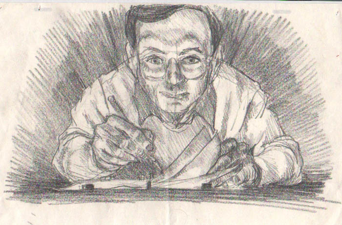
Here is the first rough sketch:
 

This includes a blocking in of the title logo, Chili Detective Magazine, (in faint blue line) and also a blocking of the mock story titles that always have to be included, because I want the final illustration to have the look of a cover as it might actually appear on a newsstand.

And since I will be having this printed by a copy service on standard letter size paper, I proportion it to just fit inside the printable area, with the idea of hand trimming the white border off with a paper cutter, giving the result its appropriate full-bleed effect. [That is, the printing would extend clear to the cut edge of the paper.]

To further prove the composition, now in Photoshop I paint in the full value range in black and white.
This step can be quite helpful for anyone tending to be timid about high contrast.  Also, going straight into color, one can fail to realize that two vividly contrasting colors juxtaposed with one another might still be very close in value. You put black where there is no light and bright highlights wherever that is appropriate, plus a good range of grays inbetween.

There is no need to get overly detailed at this stage, however.

Next, I add some color on a new layer to establish my palette, and I lay in placeholders for most of the typographic elements:

This typography was done in Photoshop, but the final will be done in Illustrator, where I have greater control and more options for effects.

Next:  The Detailed Pencil Drawing

Sunday, July 31, 2011

After the Final

In terms strictly of painting, of adjusting individual pixels, I was done.  But I couldn't resist fooling around a bit with Photoshop filters and modes, just to see what might occur.

Here is what happened when I simply increased the contrast (under Image/Adjust/Brightness-Contrast) to 100%:
(Click on pictures for larger view.)
What I got here was a hot rendition--not only high in contrast but apparently high in saturation as well.  Compare this with the relatively subdued image in the previous post.  By comparison, this is like a pulp magazine cover.  And incidentally, if you are unfamiliar with illustration for print, this much variation is well within the sort of color rendition you might expect on different press runs of the same picture without someone doing press checks.

And you know?  I like it better.  The high contrast  suits the mood of madness implied by the animator's expression.

I then tried one more thing--I wanted to see how the image would look without color. So: Image/Adjust/Black and White.  This give you a popup panel with sliders not only for yellows, magentas and cyans, but also greens, reds and blues.  I tried pushing the Yellow slider almost all the way to the right, and it naturally brightened the whole area where the light is radiating up from the animation board.

Friday, July 29, 2011

Final Painting

(Click twice on the picture to view larger versions.)
Differences between this and the last version are few and subtle but worth doing.  I did more on the shirt, working some on the shadows of the folds and brightening the highlight on the back.  The wristwatch is more detailed, and I darkened the shadowed area of the chair back.  In a light gray I added suggestions of calibration markings to the black peg bars of the drawing disk.

On a new layer I then airbrushed a dark cool tone over everything except the figure and the desktop, which has the effect of bringing up the glow of the papers and their light source still more.  As a last touch on yet another new layer, I added a mist of gold emanating from the drawing surface and reaching to the face, like light on tiny motes of airborne dust.

A few posts back, I mentioned that I had the pencil drawing layer always available in the Photoshop layer stack, above all the painting layers.  I could turn it on and off to check detail, perspective, and anything else I had first deliniated in pencil.  Just for fun, here is how the final painting looks with that layer turned on:
Final with pencil drawing overlay turned on.  Click on picture for larger view.


As you can see, this layer, useful as it was, now adds nothing to the painting except a degree of darkness and loss of saturation.  Everything I wanted from it I have transferred into the painting, which was my intention from the start.


And so it's finished, I thought.  And yet...

Next:  Beyond Final

Wednesday, July 27, 2011

Foreground Detail_Part Two

Now at last I have taken on the face, the hair, the eyeglasses with their dramatic reflections, the folds in the shirt, the edge of the desk, working with extremely small brushes in some cases, and doing some blending.  But not too much blending; I like the more painterly look and the vibrancy of juxtaposing unblended color areas.

Also, as in some of the best portrait photography, allowing some areas to remain unfocused or otherwise unresolved adds an even greater appearance of sharpness to the areas that are more fully developed.  Not everything should be in HD!

Here is the photo that was my main facial reference (and obviously also for the right hand):

Next: Finished!

Tuesday, July 26, 2011

Foreground Detail_Part One

Again, working carefully from back to front, I have now detailed the aluminum drawing disk, the hands and the papers.  A pencil appears in the right hand.

I had a number of reference photos to work from for this composition.  Here is the one I was using most at this point:
Reference material, while quite useful, should nonetheless be used selectively and not too slavishly.  But here you can see that I did rely on it heavily for the light effects on the bevel of the disc and for the effect of the light coming up through the papers from beneath.  (In case you don't know, the aluminum disc has a rectangle of frosted glass inset in its center and a light source underneath, giving translucency to the paper and thus the ability of the animator to closely relate a series of drawings to one another.)

Next: The Face and Torso

Monday, July 25, 2011

When the Background Takes the Forefront

As you see, there are few changes to the foreground from the last version.  This is very hard for me!  My tendency is to want to get right to the pose, the hands, the face, because those are the things that interest me most.  It explains part of my attraction to animation:  the animator, I once thought,  is free to play with the character and leave the background and other tiresome detail to others.

Of course this is a mistake of snobbery, for the setting and surroundings are important in the extreme to the overall persuasiveness of a scene, whether it be a single painted image or an animation sequence.  In another way of thinking, the human or other character is just the central element among a host of contributing elements.  So I have learned to give due attention to the layout and background, and I have not been sorry.

Also, in opaque media it makes sense to detail a scene from back to front  so that, once established, edges and forms closer to the front are not interfered with by any subsequent work on forms behind.

An exception here is the forward desk edge that I decided to add.  It gives a more accurate impression of the proportions of an animator's desk, and it strengthens the composition as well with its strong angle that sweeps the eye back around and into the picture.

Here was an instance where I turned the drawing layer on frequently to check the alignment of the painted contours with the ruled lines on the drawing.   I think the result is a fairly convincing space from the back wall around the corner to the wall on the left.

Next:  The Foreground At Last!

Sunday, July 24, 2011

Establishing the Palette

Here I have blocked in the colors and, to a great extent, the value range I want.  Most important is the effect of light coming through the glass and paper on the drawing disk; it bathes the animator's face in its glow, enhancing his mad and zealous look.  There is a cooler secondary light coming in from the right.  This is daylight coming through windows and must not overpower the other.

Most of the palette is made up of colors selected from this reference photo.  Note all the detail of the photo that I have left out.  As important as knowing what to put in, is knowing what to omit.

Next:  Detailing the Background

Saturday, July 23, 2011

Tight Pencil

Here I have added a little more detail and discipline to the drawing, putting in some architectural elements to the room, changing a few minor proportions, trueing-up the ellipse of the animation disk.  These are things that are hard to change at a later stage in painting so are best done now.

Ready to Paint
Now the drawing has been uploaded to a Photoshop file, the background copied onto a new layer, and the layer set to Multiply (Layer/Layer Style/Blending Options/Multiply).  This action with a gray-scale layer causes the white areas to become transparent, thus making my drawing  useful as an overlay which I will keep above the painting layers throughout the painting process, turning it on anytime I want to check the painting against the drawing for accuracy.  But the goal is to eventually make this drawing layer redundant as the painting becomes in itself fully detailed and complete.

The sepia color you see now is from a new layer added beneath the drawing layer.  This is a mid-value tone that I will now paint over and is equivalent to the wet media painting technique of laying in a mid-value brownish wash as a starting point before applying color.

Next: Establishing the Palette

Friday, July 22, 2011

Early Concept

I did this drawing many years ago, probably in the late 70s (before I grew my 'stache).*

I like the new one much better, but this does show the idea of the glow from the backlight of the animation board shining up into the animator's face as if he were some wizard enraptured by the aura of his crystal ball or magic spell.

By the way, I have a long history of self portraits that spans my entire career.  In future posts I will publish some of them.  I think you may find them entertaining, as most of them are more in the nature of cartoons or caricature than these.

*And for anyone who is a stickler for English stylebook rules, I know perfectly well that the books say that the period should be inside the closing parenthesis; I just have never liked the look of that, and I don't find it logical.

Tuesday, June 21, 2011

Maybe Not Such An Original Idea

After getting quite well along with the detailed drawing posted last, I began to get a nagging notion that I had seen it somewhere before.  But where? 

There are many known examples among writers of inadvertent plagiarism.  We are not talking about the cases of blatant lifting of whole pages of copy that have made the news recently, but actual unknowing, unintended use of someone else's idea.  You saw it or read it, you then forgot about it, but then at some point it bubbled up into your consciousness again, whereupon you thought it was your own.

At any rate, I realized that if I had seen this idea somewhere before, because of the arcane nature of the subject it would have to have been in one of my books on animation technique.  And sure enough, I found it:


It's a little drawing by Richard Williams from his book "The Animator's Survival Kit".  Still, I think my version is a justifiable re-imagining of the idea of extra fingers on the animator's  non-dominant hand.

But that's not all I turned up!  I also recalled an unpublished gag cartoon I had done years ago, circa  the year 2000, and though I haven't been able to find the original, here is a recreation:
Richard Williams excellent book was first published in 2001, so perhaps I am vindicated, at least in my own mind. 

Thursday, June 16, 2011

An Original Idea..maybe.

Here's a concept sketch I did two or three months ago, an idea to show myself flipping animation drawings bottom-peg style, but showing extra fingers on the left hand.  Just a quick scribble to jog my memory, and I filed it away.

Now I intend to start a second blog about animation only, and I got this out to work up as the illustration for the main page.  Here is the resulting pencil sketch:


This shows more clearly what I am talking about.  The flipping of drawings is specifically a Disney studio invention.  Turns out that Disney animators were trained to work on bottom pegs--that is, with the drawings secured in registration by means of pegs at the bottom of the paper rather than at the top.  Other studios like Warner Brothers used top pegs, and it has gotten to be like some sort of Swiftian divide among animators now.  Yes, the pegs at the bottom get in the way of your drawing hand, but the defense is that you can interleave drawings between your fingers, as you see here, and sort of roll them back and forth to see a simulation of animated motion.  Well, I once thought everyone did it this way, and so I trained myself to do it and now I prefer it.  Anyhow, if you had extra fingers, you could roll more drawings, right?  So there it is: the insanely happy animator.

I will be doing this as a full scale digital painting, so stay tuned.

But Next:  Maybe Not So Original An Idea?

Monday, May 2, 2011

Illustration Friday: Bottled--the painting

Executed in Corel Painter 11,  this was done in the style of the old pulp magazine covers, as perhaps  for an issue of Weird Tales.  Tons of fun!

Friday, April 29, 2011

Illustration Friday: Bottled

No sooner did I decide to participate in Illustration Friday submissions--an interactive website that gives you a week to do an illustration on a stated theme--than I got too busy to finish on time.  Nevertheless, I have kept on with it and finished.  The theme was "bottled", and here is the sketch for my digital painting to be executed in Corel Painter.  It's just a twist on the old djinn in the bottle story, showing that the djinn has gotten out and imprisoned the man in his place.  I will post the final painting in a day or two.

I really do want to post quite regularly here and will try harder now.

Sunday, January 2, 2011

The Two Roosters Final

I'll call this done now.  It was all painted in Photoshop over the imported rough sketch of post one.  I changed the Jeff Bridges proportions quite a bit in the process as I saw I had made his face too long and it was not reading well.

Caricature is an intriguing but sometimes frustrating field.  There have been people I thought would be easy to do, who turned out to be elusive, and there have been some that came to me more easily than I expected.  In a future post I will talk about favorite caricaturists, including some whose art astounds me with its ability to create stunning "likenesses" with abstract or geometric shapes.  For now I will just say that my great hero of caricature has always been Mort Drucker.