Again, working carefully from back to front, I have now detailed the aluminum drawing disk, the hands and the papers. A pencil appears in the right hand.
I had a number of reference photos to work from for this composition. Here is the one I was using most at this point:
Reference material, while quite useful, should nonetheless be used selectively and not too slavishly. But here you can see that I did rely on it heavily for the light effects on the bevel of the disc and for the effect of the light coming up through the papers from beneath. (In case you don't know, the aluminum disc has a rectangle of frosted glass inset in its center and a light source underneath, giving translucency to the paper and thus the ability of the animator to closely relate a series of drawings to one another.)
Next: The Face and Torso
An Occasional Blog By Jim Bradrick About Drawing, Illustration and Animation
My former website, bradrick.com, is no longer available.
Tuesday, July 26, 2011
Monday, July 25, 2011
When the Background Takes the Forefront
As you see, there are few changes to the foreground from the last version. This is very hard for me! My tendency is to want to get right to the pose, the hands, the face, because those are the things that interest me most. It explains part of my attraction to animation: the animator, I once thought, is free to play with the character and leave the background and other tiresome detail to others.
Of course this is a mistake of snobbery, for the setting and surroundings are important in the extreme to the overall persuasiveness of a scene, whether it be a single painted image or an animation sequence. In another way of thinking, the human or other character is just the central element among a host of contributing elements. So I have learned to give due attention to the layout and background, and I have not been sorry.
Also, in opaque media it makes sense to detail a scene from back to front so that, once established, edges and forms closer to the front are not interfered with by any subsequent work on forms behind.
An exception here is the forward desk edge that I decided to add. It gives a more accurate impression of the proportions of an animator's desk, and it strengthens the composition as well with its strong angle that sweeps the eye back around and into the picture.
Here was an instance where I turned the drawing layer on frequently to check the alignment of the painted contours with the ruled lines on the drawing. I think the result is a fairly convincing space from the back wall around the corner to the wall on the left.
Next: The Foreground At Last!
Sunday, July 24, 2011
Establishing the Palette
Here I have blocked in the colors and, to a great extent, the value range I want. Most important is the effect of light coming through the glass and paper on the drawing disk; it bathes the animator's face in its glow, enhancing his mad and zealous look. There is a cooler secondary light coming in from the right. This is daylight coming through windows and must not overpower the other.
Most of the palette is made up of colors selected from this reference photo. Note all the detail of the photo that I have left out. As important as knowing what to put in, is knowing what to omit.
Next: Detailing the Background
Most of the palette is made up of colors selected from this reference photo. Note all the detail of the photo that I have left out. As important as knowing what to put in, is knowing what to omit.
Next: Detailing the Background
Saturday, July 23, 2011
Tight Pencil
Here I have added a little more detail and discipline to the drawing, putting in some architectural elements to the room, changing a few minor proportions, trueing-up the ellipse of the animation disk. These are things that are hard to change at a later stage in painting so are best done now.
Ready to Paint
Now the drawing has been uploaded to a Photoshop file, the background copied onto a new layer, and the layer set to Multiply (Layer/Layer Style/Blending Options/Multiply). This action with a gray-scale layer causes the white areas to become transparent, thus making my drawing useful as an overlay which I will keep above the painting layers throughout the painting process, turning it on anytime I want to check the painting against the drawing for accuracy. But the goal is to eventually make this drawing layer redundant as the painting becomes in itself fully detailed and complete.
The sepia color you see now is from a new layer added beneath the drawing layer. This is a mid-value tone that I will now paint over and is equivalent to the wet media painting technique of laying in a mid-value brownish wash as a starting point before applying color.
Next: Establishing the Palette
Friday, July 22, 2011
Early Concept
I did this drawing many years ago, probably in the late 70s (before I grew my 'stache).*
I like the new one much better, but this does show the idea of the glow from the backlight of the animation board shining up into the animator's face as if he were some wizard enraptured by the aura of his crystal ball or magic spell.
By the way, I have a long history of self portraits that spans my entire career. In future posts I will publish some of them. I think you may find them entertaining, as most of them are more in the nature of cartoons or caricature than these.
*And for anyone who is a stickler for English stylebook rules, I know perfectly well that the books say that the period should be inside the closing parenthesis; I just have never liked the look of that, and I don't find it logical.
Tuesday, June 21, 2011
Maybe Not Such An Original Idea
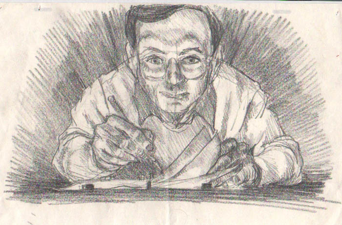
After getting quite well along with the detailed drawing posted last, I began to get a nagging notion that I had seen it somewhere before. But where?
There are many known examples among writers of inadvertent plagiarism. We are not talking about the cases of blatant lifting of whole pages of copy that have made the news recently, but actual unknowing, unintended use of someone else's idea. You saw it or read it, you then forgot about it, but then at some point it bubbled up into your consciousness again, whereupon you thought it was your own.
At any rate, I realized that if I had seen this idea somewhere before, because of the arcane nature of the subject it would have to have been in one of my books on animation technique. And sure enough, I found it:
It's a little drawing by Richard Williams from his book "The Animator's Survival Kit". Still, I think my version is a justifiable re-imagining of the idea of extra fingers on the animator's non-dominant hand.
But that's not all I turned up! I also recalled an unpublished gag cartoon I had done years ago, circa the year 2000, and though I haven't been able to find the original, here is a recreation:
Richard Williams excellent book was first published in 2001, so perhaps I am vindicated, at least in my own mind.
Thursday, June 16, 2011
An Original Idea..maybe.
Here's a concept sketch I did two or three months ago, an idea to show myself flipping animation drawings bottom-peg style, but showing extra fingers on the left hand. Just a quick scribble to jog my memory, and I filed it away.
Now I intend to start a second blog about animation only, and I got this out to work up as the illustration for the main page. Here is the resulting pencil sketch:
This shows more clearly what I am talking about. The flipping of drawings is specifically a Disney studio invention. Turns out that Disney animators were trained to work on bottom pegs--that is, with the drawings secured in registration by means of pegs at the bottom of the paper rather than at the top. Other studios like Warner Brothers used top pegs, and it has gotten to be like some sort of Swiftian divide among animators now. Yes, the pegs at the bottom get in the way of your drawing hand, but the defense is that you can interleave drawings between your fingers, as you see here, and sort of roll them back and forth to see a simulation of animated motion. Well, I once thought everyone did it this way, and so I trained myself to do it and now I prefer it. Anyhow, if you had extra fingers, you could roll more drawings, right? So there it is: the insanely happy animator.
I will be doing this as a full scale digital painting, so stay tuned.
But Next: Maybe Not So Original An Idea?
I will be doing this as a full scale digital painting, so stay tuned.
But Next: Maybe Not So Original An Idea?
Subscribe to:
Posts (Atom)